Luxury multi-use complex rises on uniquely shaped property in Ohio City
By Doug Bardwell, Properties Magazine
(Read on the Properties Magazine website)
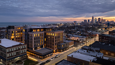
Wrapping around Franklin Circle is Ohio City’s newest luxury multi-use complex, The Dexter. Located at 2800 Franklin, this 116-unit, five-story apartment also offers 8,000 square feet of retail/restaurant space on the first floor.
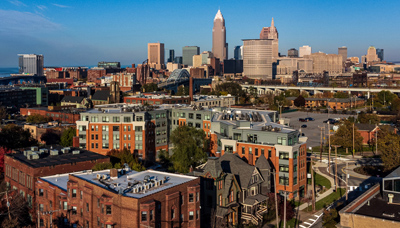
Reflective of the walkable nature of Ohio City, The Dexter blends seamlessly into the fabric of the neighborhood. In scale with neighbors Lutheran Hospital and the old Masonic Temple, the LEED Gold, $29-million building even offers street-level living units and a unique pedestrian walkway through to Hingetown.
New Opportunities
CASTO, a nationally known real estate developer and management firm from Columbus, was drawn to the Cleveland market in 2017 with the redevelopment opportunity around the old Lakewood Hospital site. They teamed with Dimit Architects and North Point Realty, and are still negotiating to bring their vision of a mixed-use development to reality in Lakewood.
During that process, they learned about another development opportunity in Ohio City, across from Lutheran Hospital and the historic Heyse project. The irregular shaped parcel, which consisted of a few residential lots and a small parking lot, came in at just more than an acre, and offered opportunities for both commercial usage and apartment living.
“We look for properties where we can be a part of the central city,” says Kolby Turnock, vice-president of CASTO. ‘It was important to us that the building fit into the neighborhood and its historical context, but with clean lines and modern amenities. Having worked very successfully with Dimit on the Lakewood exercise, when this project came up, it was just a natural to bring them in as well.”
“One of the things we admire most about CASTO’s portfolio of residential work is that it includes great historical conversion projects, and respectful historic context-inspired work.” says Scott Dimit, principal with Dimit Architects.
Pride One then became the third part of the team. “We were asked to perform a conceptual budget,” says Tim Courtad, partner/president of Pride One Construction. “From conceptual budget, we helped design assist with the architect and CASTO to develop the permit set of drawings. It is very helpful to have the input of all parties when developing a project. The final drawings were produced and detailed out over the pre-con phase. Once we were able to start site work, we had already been working on the project for over 6 months.”
“My favorite aspect of this project,” adds Dimit, “is visiting the neighborhood now, and seeing what a great fit this building has with its neighbors – how the scale, massing, and selected materials really respect the context of Franklin Circle – right down to the amber brick tones picked to harmonize with the amber brick building to the south and how the faceted façade cradles the newly re-created traffic circle. During the design phase, we learned of the City of Cleveland’s plan to eliminate the five-way intersection, and return it to a historical roundabout, which significantly impacted how the building relates to the public right of way.”
“Adding to the complexity of the project was that the city was creating the circle at the same time we were beginning our construction,” comments Ryan Ruschak, project manager for Pride One. “It certainly did require coordination with this work going on at the same time.”
“I was impressed with how well the architects wrapped this building around the irregular shaped property, maximizing the space,” says Ruschak. “My favorite part of the building is the exterior façade, even though all the angles, bump outs and changes in material type presented its challenges during construction, Dimit did a great job in the overall design and it really makes the building pop.”
“There’s a Victorian home on Franklin immediately to the west of this parcel,” points out Ted Singer, project architect with Dimit Architects, “and as you are looking toward West 28th, The Dexter blends with the scale of the neighboring structures”
“We took a lot of pains pulling the massing back from that corner,” adds Dimit, “and allowed the historic home to keep its airspace.”
“Then,” continues Singer, “as you approach the circle, the building seems to shape-shift, in scale with the larger commercial buildings found there.”
Fitting into the neighborhood
Given the fact the almost the entire parcel is taken up with the building’s footprint, and the fact the work was going on with the rerouting of Franklin Circle out front, material delivery and storage was going to be a challenge. Luckily, with Dexter Place dead ending at the building, it became an invaluable material lay-down & staging area.
“I felt lucky to work with Mike Ammon, superintendent for Pride One,” says Singer. “When challenges would crop up, the two of us worked well together to solve each of them. He really took great pride in this project which translated to a great partnership.”
Following the slightly sloping site, the lower level and the first floor are both precast concrete, while the top four floors are conventional stick-built wood construction. Flat wooden roof trusses are covered with plywood, tapered insulation and a white TPO finish surface.
Individual HVAC systems for each apartment have an air handler in each suite and a condenser on the roof. Exhaust louvers for each suite closely approximate the brick color, making them all but imperceivable to the passerby.
Aluminum glass curtain wall is used for the retail and management offices areas. Then, fiberglass windows and doors are used throughout the residential floors.
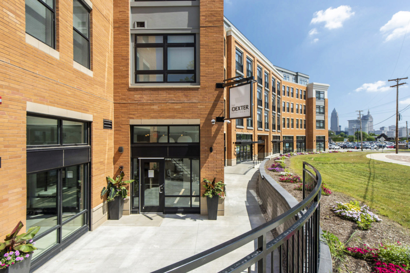
The building presents itself to the neighborhood with an invitingly warm amber brick on a cast stone base, highlighted by a buff-colored cornice to match the cast stone atop the fourth floor, where the penthouse apartments step back. A medium grey Hardi-board siding rings the building on the penthouse level and occurs around residents’ windows on levels two through four.
Interior abounding with artwork
Tastefully furnished and decorated, the mainly white interior walls are punctuated by a bold splash of colorful artwork mounted on the walls. “We wanted to bring the character of the neighborhood inside the building,” says Analía Nanni Dimit, director of interior architecture with Dimit Architects. “We intentionally selected lighter, neutral materials, allowing the artwork to bring the building to life.”
Across from the elevator, an entire wall of local artists work is featured, with most photographs featuring areas within a quarter mile of The Dexter. “We were very happy having the Curv Imaging and Dimit team guide us through the artwork selections and installation,” recalls Turnock.
The things people mention most, according to Turnock, is their love of the clean lines, artwork and the furniture- carefully selected by the Columbus firm ASCH.
Amenities help sell the building
The southwest corner of the building houses the main lobby for the apartments, along with the management offices, package room and fitness center. An automated Starbucks coffee dispenser in the lobby is available to residents as well as prospective apartment seekers.
Behind the management offices is a well-equipped fitness center with exercise bikes, ellipticals, treadmills, yoga balls, and free weights. Flooring is a comfortable Ecore roll rubber floor with a terrazzo pattern. Large storefront glass and clerestory windows look out onto Franklin Circle.
The highlight of the room however is the wrap-around, floor-to-ceiling historic ‘Birds Eye View of Cleveland Ohio 1877’ mural. The giant map features the entrance of the Cuyahoga River, downtown and the neighborhoods surrounding Ohio City. A circular highlight enables viewers to quickly identify The Dexter’s location on the map. Done in shades of burnt orange and browns, this elegant piece is the work of Bernie Sigal from Curv Imaging in Westerville, Ohio.
Outside the lobby, an exterior walkway with stone-look retaining wall, extends past both retail areas, past a pedestrian walkway through to Dexter Place on the northwest, and around the corner onto West 28th Street.
Dexter Place, which used to extend to Franklin, now ends in a six-car, surface parking lot and the entrance to the parking garage on ground level. Colorful murals liven this northwest façade, effectively giving even the rear entrance a “front door” vibe. The pedestrian walkway through the building on ground level not only connects Hingetown to Ohio City, but also offers a place for art and street-level dining to mix, under the protected cover of the building.
“We worked with Ohio City Inc. and CASTO to identify artists that could create the murals in this area,” explains Singer. “It helps to enliven the public areas and pedestrian corridor.”
Unique in the Ohio City market
The West 28th Street façade on the northeast side is home to two street-level living units with high ceilings: a one-bedroom and a two-bedroom, both with convenient street access. Next to these apartments is the entrance for the lower level, larger parking garage. Combined, the two garages offer a total of 110 parking spaces. An enclosed room on the lower level offers lockable bike storage.
Floors two through four each have 32 units. Units range from 345-square-foot studios to two-bedroom units starting at 858 square feet. Most units have single baths, while a few include a guest bath off the living area. Center units on each floor facing Franklin Circle and West 28th Street have Juliet balconies.
“We did lots of studies regarding suite layout,” says Dimit,” and now all the suites wrap around the circle’s geometry in a rather complex way, but allow for great views and light penetration.”
“As a result of our public review process, you’ll notice the top floor has a different material for the face and is set back to visually reduce the height of the building” adds Gary Ogrocki, principal with Dimit Architects. “That was to address concerns about the building appearing too high as it stretches into the surrounding residential neighborhood.”
Standard throughout are artisan gray Hanstone quartz countertops on white, Shaker-style Summit cabinets from Smart Cabinetry, with round, stainless-steel pulls. Backsplashes feature light grey, 3-inch by 6-inch Largo ceramic tiles. The appliances, faucets and deep, single-bowl kitchen sinks are stainless-steel. The flooring in the living area of the units is luxury vinyl tile, while bedrooms and closets have broadloom carpet.
“In Ohio City, the rental market demands a higher level of finishes,” says Turnock, “so we looked for ways to select products that would separate our project from others.”
Bathrooms feature similar finishes and have large walk-in showers with modern glass doors, tiled walls, and fiberglass pan.
Penthouse apartments, on level five, are primarily larger, including one, two, and three-bedroom units with one, two, or three baths. Units with two or three bathrooms have ceramic tile floors. Cabinetry on this floor is also upgraded with all soft close hardware.
“It’s almost like staying in a nice European hotel with great views,” reflects Dimit, “so you can open up the French doors and then step out onto your own balcony.”
Set back from levels one through four, the penthouses benefit from exterior composite terraces offering spectacular views of the Cleveland skyline, Lake Erie, and the Gold Coast. These “Juliet” balconies comprised of Andersen patio doors offer not only great sightlines, but loads of fresh air as well.
The community room that grew
Increasing the size of the community area on the penthouse level was an early decision that the design team and owner agreed would be worth it. They sacrificed one additional penthouse suite, but ended up creating an amazing, welcoming area that residents love.
“Another key element that’s popular with our residents is that Friday Night Fireworks are back with the Indians baseball games,” says Dominic Edwards, community manager at The Dexter. “Many of them are able to enjoy them from either their suite or the community rooms on the penthouse level.”
Level five is home to extraordinary gathering spaces in the L-shaped, connected Game Room and Community Room. Exterior Pella sliding glass panel doors can open entire walls for fresh air in the spring and fall. Outside seating offers even more areas to socialize on this wide portion of the exterior terrace.
Standing at the northern corner of the terrace, residents and guests enjoy an immense panorama of the north shore, with both sunrise and sunset perfect viewing opportunities.
Inside the community spaces, more artwork enlivens the environment, along with deep-orange leather sofas and seating. Area rugs counterbalance the linear plank flooring and invite group conversations.
Two separate serving areas with sinks and an undercounter refrigerator enable multiple events to occur simultaneously. One even includes a beer tap.
“I’m sure the residents will enjoy the rooftop lounge” says Analía Nanni Dimit. “We designed it to feel like an extension of their living room. With a kitchenette and fireplace we anticipate a lot of people entertaining here instead of in their apartments.”
From acquisition to completion
After negotiating for the parcel in 2018, from start to finish, this 176,500-square-foot project moved quickly to completion; despite COVID-19, material shortages, and the City of Cleveland reconfiguring the frontage of their property while recreating the Franklin Circle.
“It was the first time working through the public process here in Cleveland,” recalls Turnock, “but Gary Ogrocki and Ted Singer from Dimit helped guide us through it. Ohio City Inc. was also a tremendous partner throughout the process, and we were extremely impressed with Tom McNair and his group. Many of their suggestions were incorporated, making this a better project.”
“Anytime we can go through the zoning and entitlement process in less than nine months is a success in our books – and that’s just about what this was.”
“While the building design changed significantly from our initial concept,” states Dimit, “it changed for the better, and definitely reflects CASTO’s respect for historical context, which is one of the things we like most about working with them.”
”CASTO has been a great teammate developing this project,” adds Courtad. “They take the ‘We’ approach to management, making this difficult project easy to navigate. Core Value Alignment, teamwork, and communication are all major influences in a successful project. We were fortunate to have all three on this project with CASTO and the rest of the team.”
“While we’ve done many urban projects before, and we are working on a complex historic tax credit project now, The Dexter stands out uniquely,” concludes Turnock. “This really hit a sweet spot for us as far as an infill project, because we like to be imbedded in the fabric of the community, rather than out on the arterial roads. While the site was challenging in form and shape, the Dimit team took it from there and really came up with a beautiful building that’s been extremely well received in the market.”

